Table of contents:
- The Corporate ROI Debate: Interns vs. That $8,000 Monthly Bill
- The Unemployment Myth: Chill, Your Job’s Probably Safe (For Now)
- Openclaw Skills Marketspace in Action: Where the Fun Truly Begins
- Privacy and Security: A Rational Approach to Open Claw
- How to Actually Use Openclawd AI
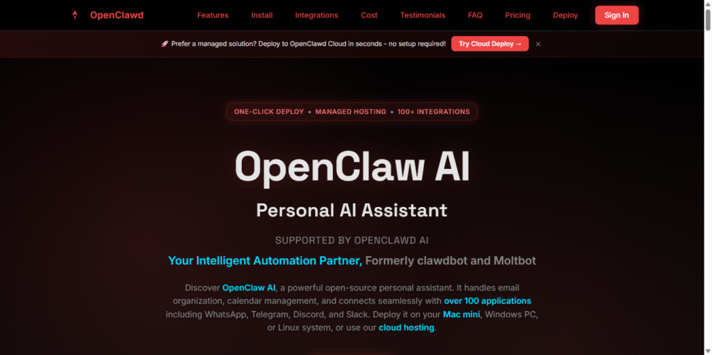
Openclawd AI arrived with a massive bang, man. One minute we’re all just casually hanging out with our gentle chatbots that basically only exist to entertain us with mid puns and digital fortunes, and the next, the only name anyone’s thirsting over is this open-source AI that actually does what it’s told. Fast as you can say ‘open claw,’ people jumped on the bandwagon like it was the last slice of pizza at a party. But is the open claw all it’s hyped up to be, or is it just another over-engineered tool biting off way more than it can chew?
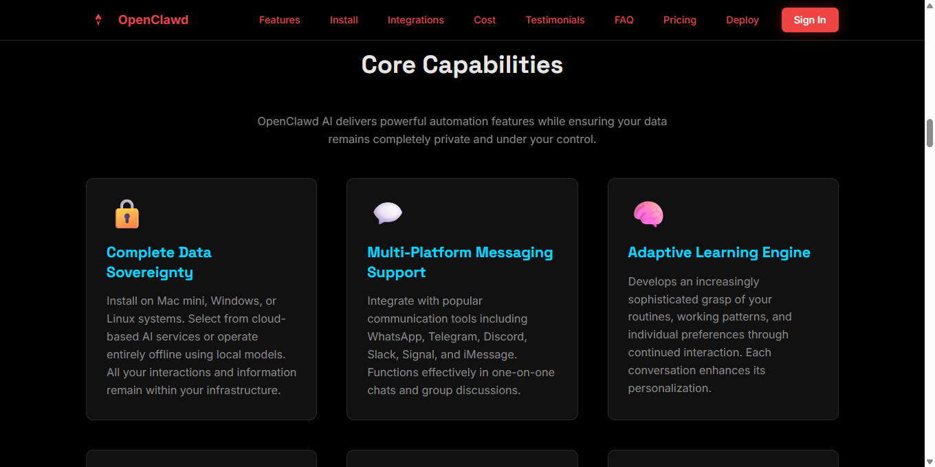
I dived headfirst into the chaos, and honestly, it feels scary real at first. Openclawd basically crawled out of the ground from Clawdbot and Moltbot, re-branded as this personal AI you can run right on your own box. You hit it up on WhatsApp, Telegram, Slack—whatever chat app you’re already using to avoid real human contact. It remembers your baggage, fires off emails for you, books your escape flights, and manages your messy calendar. It’s basically that one reliable, sleep-deprived friend we all have. No wonder everyone’s losing their minds over Openclawd.
But here’s the kicker: not every corporate suit is buying into the “AI takeover is imminent” hype train. They’re flirting back and forth like a bad Tinder match, trying to decide if they should shell out big bucks on Openclaw AI development or just hire some desperate, cheap intern to handle the grunt work.
The Corporate ROI Debate: Interns vs. That $8,000 Monthly Bill
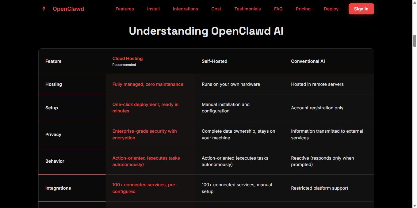
The bot doesn’t need a mental health day. It doesn’t call in sick with a fake cough. It doesn’t ghost you when the deadline is breathing down your neck. It’s grinding 24/7, either on your local machine or through Openclawd AI’s hosted platform (you know, if you’re a total Luddite). Some teams are obsessed with how this robot handles the drudgery without whining once. Others are just freaked out by the up-front cost and the headache of setting the damn thing up.
The Unemployment Myth: Chill, Your Job’s Probably Safe (For Now)
Everyone’s screaming about AI coming to snatch our paychecks, right? “Openclawd AI is coming for us all!” Take a chill pill for a second. Right now Openclawd works more like a power-up than a robot overlord. It levels up what you’re already doing; it doesn’t just kick you out of the office. Give an open claw some repeatable tasks without any nuance, and watch it shine—sorting emails, glancing at calendars, or even pushing code changes as a total no-brainer if you set it up right!
It still needs our messy, human hands. Freaking about mass unemployment feels a bit premature given how Openclaw AI still lacks basic human judgment and empathy. A lot of people are saying Openclawd actually gives them a fighting chance. Designers use it to whip up mockups in seconds, writers use it to dig up research deep-dives, and devs offload all that mind-numbing boilerplate code. It’s not job-stealing; it’s job-changing. Openclawd is the part that lets you stop being a cog and start doing more of the fun stuff!
Sure, some routine gigs will get downsized. But history shows that technology usually creates more opportunities than it kills off. Remember when spreadsheets were supposed to end accounting? Instead, accountants just started doing more strategic, big-brain work. Same vibe here with open claw. The winners will be the ones who learn to ride the wave instead of trying to punch the ocean.
Openclaw Skills Marketspace in Action: Where the Fun Truly Begins
It’s like giving your lobster friend some high-tech, reinforced armor (and yeah, the branding is hilarious with the whole claw and lobster theme).
Surprisingly, there’s a ton of email and calendar automation skills that sort your messy inboxes, reschedule those annoying invites, and draft replies that actually sound like a human wrote them. For the coders, there are GitHub skills that manage your repos, issues, and commits without you ever having to leave your editor. It handles tasks in Linear (or whatever PM tool you use to stay sane), and Openclaw AI is there to nudge your team when they inevitably forget to do something. I’ve seen custom automations where one person builds skills to tackle customer support tickets, while another uses Openclaw AI to track their personal reading list.
The market feels alive because any rando can create and share Openclaw Skill packs. You don’t even have to be a coding whizz—many skills are ready to just drop in and go. Productivity is going absolutely insane in today’s workflows: sales teams are closing deals quicker, support reps are tearing through tickets, and creators are spending way less time on boring admin junk. If you’re still uninitiated but curious, just dip your toes into the basic Openclaw Skills. You’ll see how fast Openclawd connects with your everyday grind.
Privacy and Security: A Rational Approach to Open Claw
Corporate types are constantly freaked out over leaks, and honestly, for once they’re right. Using a cloud AI with your sensitive data? That’s a total nightmare scenario. But you’ve got local options with open claw, so you can finally rest easy. Your data remains your own by default. No prying corporate eyes watching you unless you’re lazy and opt for the hosted Openclaw AI version. Compare that to the usual human mess—interns and employees leak stuff all the time, whether they mean to or not. At least with Openclawd, you’re the one holding the keys to the kingdom.
Of course, it isn’t all sunshine and rainbows. Some early users ran into hiccups with exposed instances or permissions that were way too loose in custom skills. But the community is fast, sending out fixes, and those sandbox options help a ton. Open Claw deals with many concerns better than fully remote tools since everything stays under your own roof. Still, play it smart.
How to Actually Use Openclawd AI
Honestly, it’s somewhere in the middle—a seriously handy tool that’s evolving fast but isn’t ready to replace actual humans across the board just yet. The hack? Don’t buy into the FUD or the “hero” narratives. Think of Openclawd as your personal upgrader. Start at the ground level with Openclaw on your machine, try out a couple of Openclaw Skill ideas, and see how it fits into your life. Use Openclaw to kill the boring tasks so you can actually go do something awesome.
For individuals, it gives time back for passions and learning. At work, Openclaw AI teams move faster without breaking people. We worry about unemployment when the best stuff actually comes from people + Openclawd. Stay tuned for updates—this space moves incredibly fast, with new skills and features popping up constantly. From solo creators to small business owners to big-name corps, everyone can use Openclawd to have a bit of fun without putting their whole life at risk.